
UNSOLVED
M
MdmBarbarella
1 Rookie
•
101 Posts
•
19 Points
3
830
June 11th, 2026 11:07
OME 4.7, User Interface unusable
Hi at all!
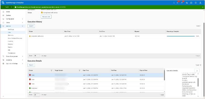
With the change to version 4.7 the user interface of OME changed in an uncomfortable manner. Setting filters is very complicated. The output of job reports is very hard to read. As an example a added a screenshot from a job report. The details of the single job are now in a very tight window so that the text is nearby unreadable. In addition, there is no longer an output whether the name of iDRAC is resolvable or not.
In the list of firmware an drivers to install I must zoom out to 80% to very small letters to see the complete list.
As a result I switched back to 4.6. The version 4.7 is not usable for me.
Greetings Barbara
1
2
Posted June 13th, 2026 18:05
Totally agree on degraded user experience.
Initially I thought my 13" laptop 1920x1080 was not good enough, but UI looks terrible on 2K LCDs same wise.
1. UI just don't fit in unless I do 80% zoom out in browser. Refactor font size and margins, please.
2. Pie charts, Titles eat all the usable height. Data is locked in bottom right quarter of the screen. More space to event data!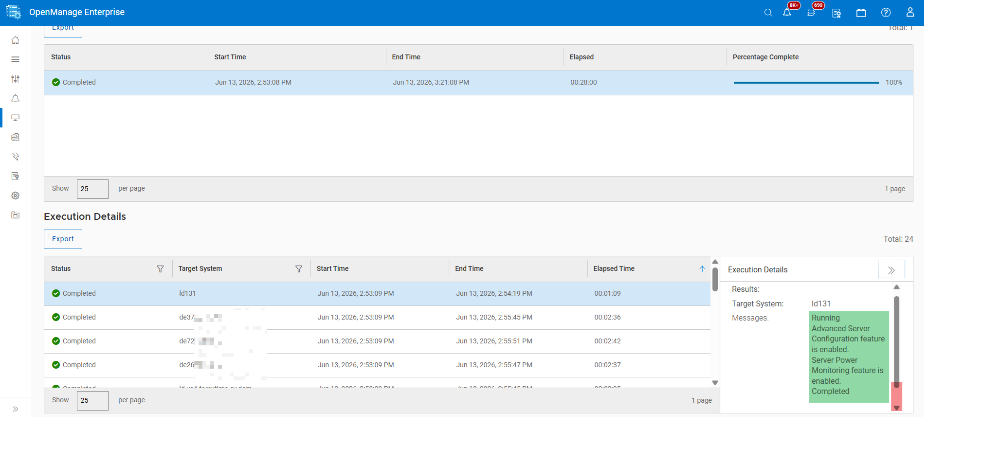
3. Panels resize is missing completely, please add.
4. Filters in reports like Firmware compliance, implemented as drop-down and require extra clicks vs old layout, which had a block with all advanced filters ready.
Advanced filters hover menu miss simple things like "component type" or "reboot required".
Expand advanced filters back to a full-scale block.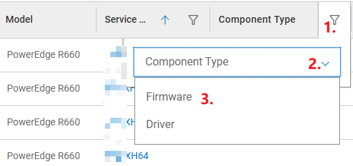
5. Moving top menu to the left is arguable decision. New menu lacks unpinned hover mode: you have to click to hide it, then click once you need it again.As we can't revert this train, please improve small things above.
(edited)
5
1
Posted June 20th, 2026 11:35
It's really a backwards step, none of our server admin types have anything good to say about it.
Everything now expands out left to right forcing you to zoom out to try and see the entire screen. Other things that don't work, when you select how many servers to display on a page the setting doesn't stick.
If you are going to change the UI, at least give people the option to remain on the existing menu system, or switch to the new one.
Just because you could change the menu system, doesn't mean you should have.
Hopefully this is fixed when you roll out version 4.7.1!
(edited)
6
1
Posted June 25th, 2026 18:40
I can only agree. Sadly I cannot go back to 4.6, and I fear that 4.7 will be necessary to go the newer fixed 4.7.1 or 4.8 or whatever it will be. But a fix is definitely needed asap. Productive work is not possible with the new UI.
6
1
Posted June 26th, 2026 12:16
Hi,
you could go back to 4.6 with a reinstallation of OMEwith kind regards Martin/ Liebe Grüße Martin
Did I answer your query? Please click on ‘Mark as Accepted Answer’. ‘Thumbs up’ the posts you like!
DELL-Martin S
Social Media and Communities Professional
Dell Technologies | Enterprise Support Services
#IWork4Dell
6
1
Posted June 26th, 2026 12:24
@Dell-Martin S Well, you're right. Technically I could do that. But then I need to configure everything again and re-import all the machines. Currently this is too much effort. I might decide that way if our users start to threaten me about the bad UI behavior. So far they "just" complained :-)
7
1
Posted June 26th, 2026 15:34
No judgement, but you should have had a VM snapshot before any upgrade and a regular backup for this infra VM generally.
MCP didn't work for me out of the box, which was the final nail in the coffin. I did roll back to 4.6.(edited)
8
0
Posted June 26th, 2026 16:45
@Fedor.Travinsky No offense. I had a snapshot. The upgrade went technically well, so I deleted it. Until we started to do real work with it again. Maybe I was a little fast with the removal... that'll teach me for the next time.
In my defense: The new version update will be (from experience) probably only possible from 4.7 if it's e.g. a 4.8. Maybe not, if it's a 4.7.1. We'll see.
9
1
Posted July 7th, 2026 06:17
Hi,
we have plans in the next release (4.8) to optimize the web UI so please be paitence.with kind regards Martin/ Liebe Grüße Martin
Did I answer your query? Please click on ‘Mark as Accepted Answer’. ‘Thumbs up’ the posts you like!
DELL-Martin S
Social Media and Communities Professional
Dell Technologies | Enterprise Support Services
#IWork4Dell
14
2
Posted July 13th, 2026 23:14
we upgraded our test environment and there are some stuffs of the new UI i actually really like, but the actual important stuff is baffling on how difficult some of it is to read. Small task box. the inconsistent search, how bad the template configuration is now because you can't resize the menu is crazy. i can't imagine the person who made these UI changes actually uses OME.
i hope 4.8 comes out soon because our prod is still running 4.6 and since that upgrade we had some crazy performance issues. ome locking up, memory and cpu usage spiking.

MdmBarbarella
1 Rookie
•
101 Posts
•
19 Points
8
0
Posted June 11th, 2026 11:32
At one point I was mistaken. The version 4.6 shows also not the IP address of the iDRAC during update. But I can say, that at least one of the failed servers in the picture worked with 4.6.